March 27, 2023
3 Ways to Improve Your Non-Profit Website’s User Experience

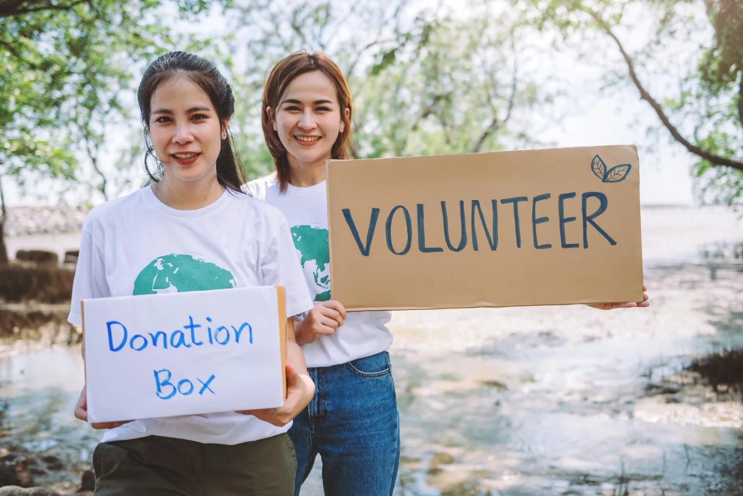
Your non-profit website serves as your online “home” and the primary point of contact for supporters. It performs a variety of functions related to supporter engagement, such as collecting donations, sharing educational resources, and facilitating advocacy campaigns. That is why it is critical for your website to provide an excellent user experience.
If your website is useful and easy to use for supporters, it will increase conversions and help spread the word about your cause. This guide will go over three methods for improving the user experience on your nonprofit’s website:
Accessibility
It’s simple to argue for enhancing your site with the user experience in mind because accessibility and user experience are intertwined. When your website is accessible, more visitors will be able to interact with your material, which will result in increased engagement rates. Additionally, you’ll develop a reputation as a non-profit that respects diversity. Both are strong arguments for giving accessibility top priority. The best justification, though? It is the prudent thing to do!
Firstly, Rrecognize that accessibility is a spectrum rather than a binary first. There are many different accessibility issues, and each has a different severity level. To the greatest extent feasible, you want to ensure that your website is accessible. Anyone visiting your website should be able to find their way around.
Revisit your form design
A supporter may visit your website for a variety of reasons. One is to educate yourself on your mission and look for ways to support it. Every organisation wants to persuade visitors to really act, whether it is by giving money, signing up for an event, volunteering, or completing an advocacy task (i.e., emailing a representative). Remove obstacles and make it as simple as possible for supporters to act when they arrive on your website and are prepared to do so. Supporters typically engage in action by filling out a form (donation form, sign-up form, etc.). So, enhancing such forms should be your main objective.
Quick and convenient page load
There are only a few seconds on your website to make an impact. Today’s website visitors want rapid page loads across all platforms. When a page takes longer than 3 seconds to load on a mobile device, more than 50% of users will depart. Visitors become impatient with slow loading speeds and are more likely to leave your site. In contrast, quick load times improve online user experiences and increase audience confidence.
Another justification for keeping an eye on your website’s loading time. Slow website loading times can lower your search result ranking because Google utilises page speed to rank search results. Your website should generally load in 2 seconds or less.
Final Thoughts
A key communication channel between your nonprofit and its supporters is your website. It’s where advocates can spread awareness, funders can make online contributions, and general supporters can find out more about your cause.
This makes any investment in the user experience of your website beneficial. You’ll get off to a wonderful start if you follow these suggestions. To take your website to the next level, you might also think about collaborating with a web development team that focuses on charitable websites.
Tags :
Your non-profit website serves as your online “home” and the primary point of contact for supporters. It performs a variety of functions related to supporter engagement, such as collecting donations, sharing educational resources, and facilitating advocacy campaigns. That is why it is critical for your website to provide an excellent user experience.
If your website is useful and easy to use for supporters, it will increase conversions and help spread the word about your cause. This guide will go over three methods for improving the user experience on your nonprofit’s website:
Accessibility
It’s simple to argue for enhancing your site with the user experience in mind because accessibility and user experience are intertwined. When your website is accessible, more visitors will be able to interact with your material, which will result in increased engagement rates. Additionally, you’ll develop a reputation as a non-profit that respects diversity. Both are strong arguments for giving accessibility top priority. The best justification, though? It is the prudent thing to do!
Firstly, Rrecognize that accessibility is a spectrum rather than a binary first. There are many different accessibility issues, and each has a different severity level. To the greatest extent feasible, you want to ensure that your website is accessible. Anyone visiting your website should be able to find their way around.
Revisit your form design
A supporter may visit your website for a variety of reasons. One is to educate yourself on your mission and look for ways to support it. Every organisation wants to persuade visitors to really act, whether it is by giving money, signing up for an event, volunteering, or completing an advocacy task (i.e., emailing a representative). Remove obstacles and make it as simple as possible for supporters to act when they arrive on your website and are prepared to do so. Supporters typically engage in action by filling out a form (donation form, sign-up form, etc.). So, enhancing such forms should be your main objective.
Quick and convenient page load
There are only a few seconds on your website to make an impact. Today’s website visitors want rapid page loads across all platforms. When a page takes longer than 3 seconds to load on a mobile device, more than 50% of users will depart. Visitors become impatient with slow loading speeds and are more likely to leave your site. In contrast, quick load times improve online user experiences and increase audience confidence.
Another justification for keeping an eye on your website’s loading time. Slow website loading times can lower your search result ranking because Google utilises page speed to rank search results. Your website should generally load in 2 seconds or less.
Final Thoughts
A key communication channel between your nonprofit and its supporters is your website. It’s where advocates can spread awareness, funders can make online contributions, and general supporters can find out more about your cause.
This makes any investment in the user experience of your website beneficial. You’ll get off to a wonderful start if you follow these suggestions. To take your website to the next level, you might also think about collaborating with a web development team that focuses on charitable websites.